


AfroFest Toronto
Brand Concept
Brand Identity & Strategy / Illustration
Signage / Livery /
Digital Design
AfroFest is an annual African music & culture festival held in Toronto during the summer season. It is energetic, lively & creates a sense of community for the Black population in the city who come from different places. The goal is to create a stronger connection between the attendees and the festival & to increase the global out reach by designing an identity that is unique, expressive & bold.

The Problem
The festival lacked an identifiable and cohesive brand identity. Despite its cultural vibrancy, the festival relies on a single logo that is low-resolution and busy, limiting its usability and brand consistency.
Creative Strategy
A full brand system designed to provide hi-res assets and a cohesive visual style that explores traditional African textures, fabrics, typography, and art.
Our Goal
A full brand system that is driven to attract new and recurring attendees, curate impactful marketing campaigns, and fuel exploration and innovation with the festival's OOH and event signage.

Original Wordmark

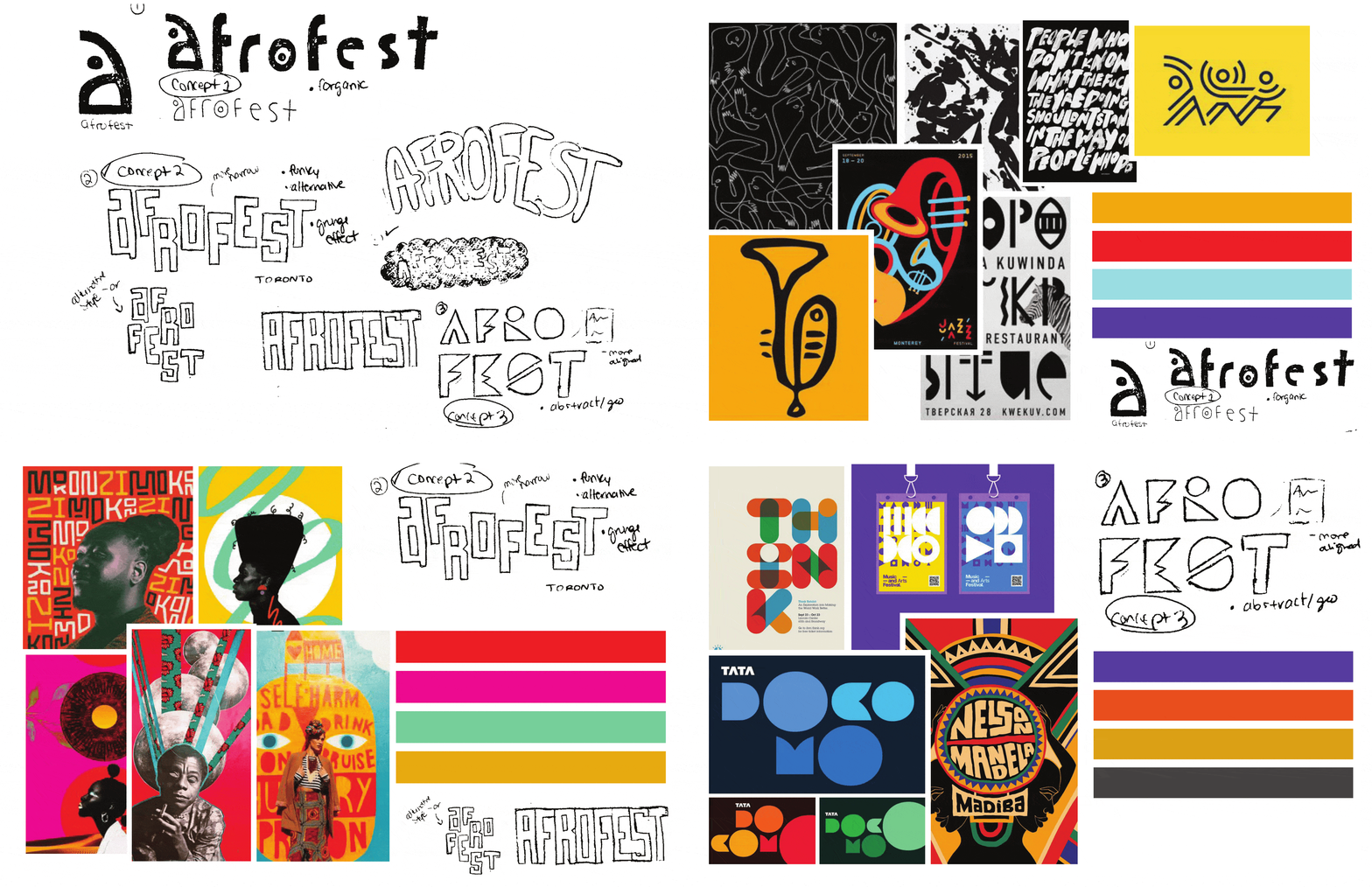
The New Branding
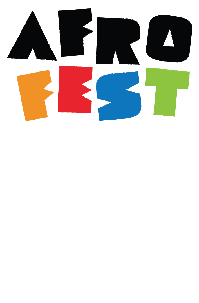
The refreshed AfroFest logo draws from traditional African fabrics, textures, and organic typography to celebrate the vibrancy and diversity of over 3,000 ethnic groups across the continent. Designed to be culturally in tune and highly versatile, the identity extends seamlessly into a bold, fully usable brand system and impactful OOH signage, enhancing festival visibility and elevating the attendee experience.

Colour Palette
We chose to carry over the colours from the original logo to the refreshed brand. The colour palette boosts African pride by naming the primary colours after four African countries. The naming of the secondary colours also highlights Africa's diverse geography.
Typography
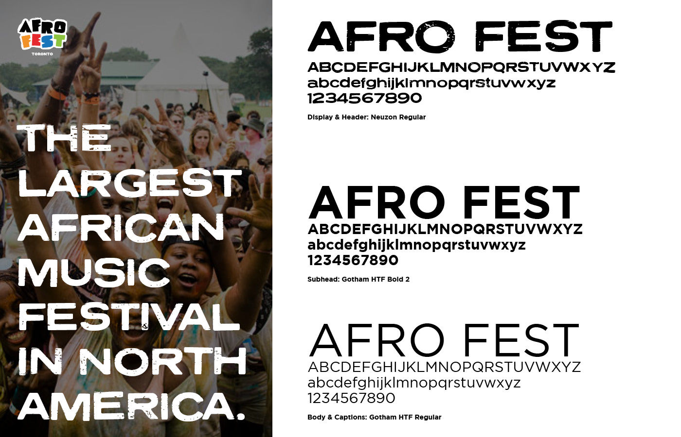
We used Neuzon Regular, a sans-serif typeface with a rustic style, to add more texture to the brand beyond patterns and imagery. Gotham HTF Bold & Regular offers a clean and rounded type style that contrasts Neuzon Regular. This creates a clear display of text hierarchy throughout type applications.
Icons
We illustrated custom icons to highlight the core themes and activities at AfroFest. These icons feature organic, hand-drawn shapes and textures, creating brand consistency throughout the logo, typography, and patterns.


